React landing page sections for shadcn and Tailwind
Assemble a landing page from sections that already agree on spacing, type and motion, or install a whole site and change the words. Every section works in light and dark and mirrors for right-to-left languages.
$ pnpm dlx shadcn@latest add @ballmac/hero-1Blocks
More blocks like these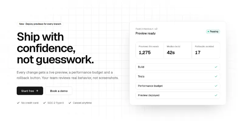
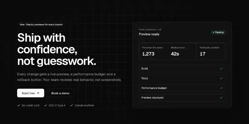
Split hero: badge, word-by-word headline, two calls to action and proof points on the left, a live product summary card on the right, over an animated grid.
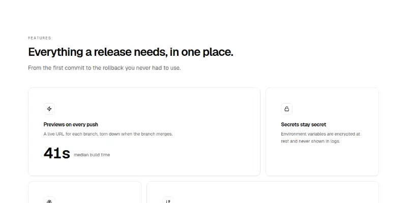
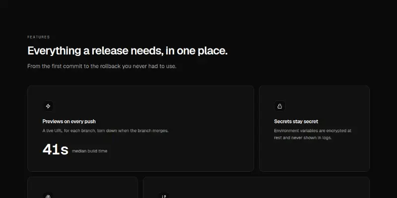
Bento feature grid of spotlight cards in two sizes, with an animated stat and keyboard-shortcut hints mixed in for texture.
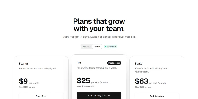
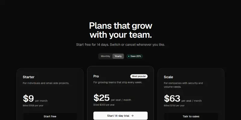
Three plan cards with a monthly/yearly switch. Prices roll to the new value, a savings badge and billed-total line update, and the middle plan is lifted with a border beam.
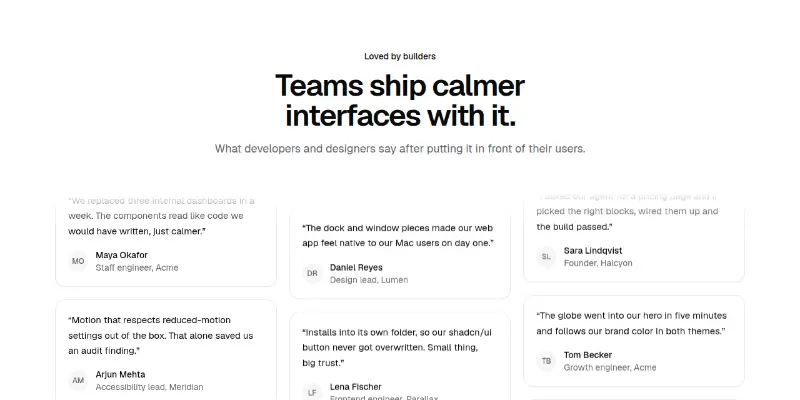
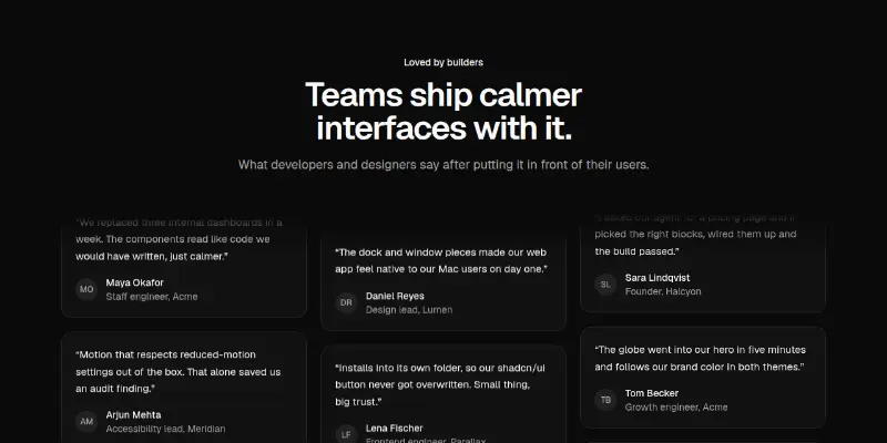
A wall of testimonial cards in three columns that scroll at different speeds in opposite directions, pausing on hover, with a plain list on phones.
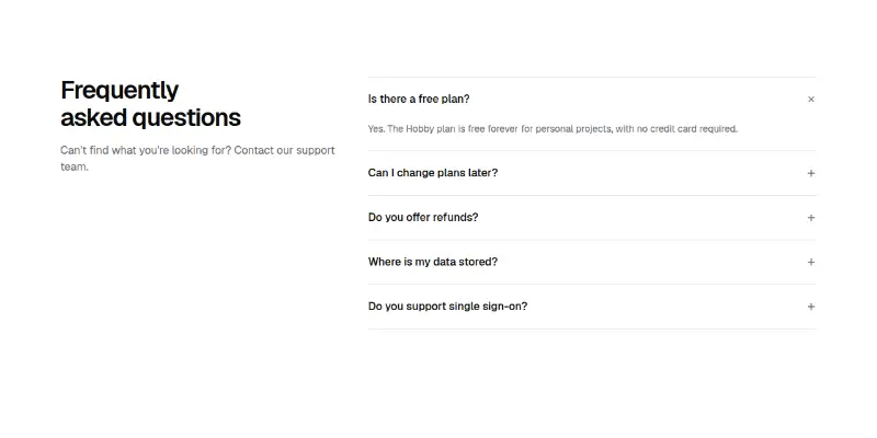
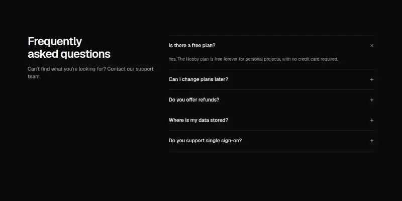
Frequently asked questions in an accessible accordion, with the heading and a help line in a side column on desktop.
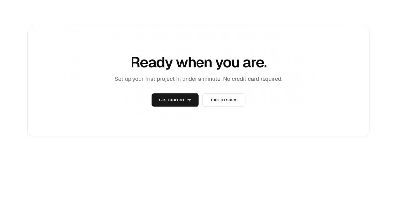
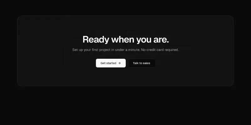
A closing call-to-action panel: large heading, one line of reassurance and two buttons, over a softly lit animated grid.
Whole sites and apps
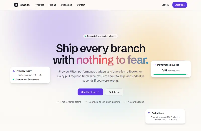

A four-page product site assembled entirely from Ballmac blocks (Hero6, Stats1, Features5, Testimonials2, Cta3, Pricing2, Pricing3, Faq2, Changelog1, Contact1) in one palette, so any section can be swapped for another block.
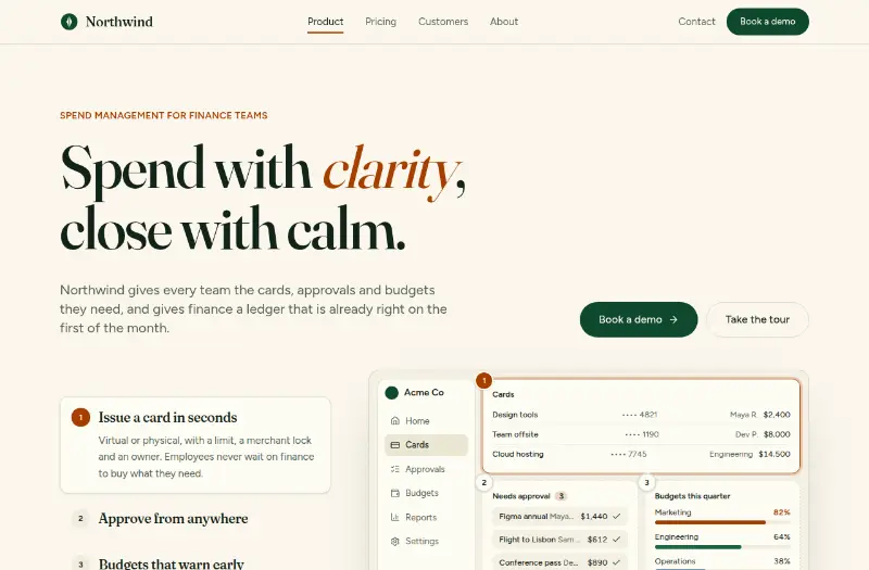
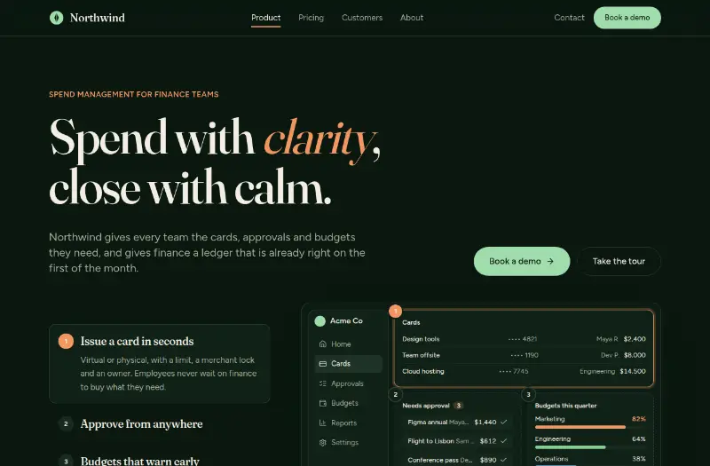
A warm, editorial five-page site for a B2B product: serif headlines on cream paper, an interactive product tour with numbered pins, case studies, pricing, an about page and a demo request form.